
Some title I'll come up verryyyy soon
UX design, User Research, Vibe coding, Product Design, UI Design, Service design
Retail, Training Management
"The current one feels old and boring, staffs are treat it as an extra task."
Inspired by video games, I redesigned the platform with a stronger visual identity and playful interactions.


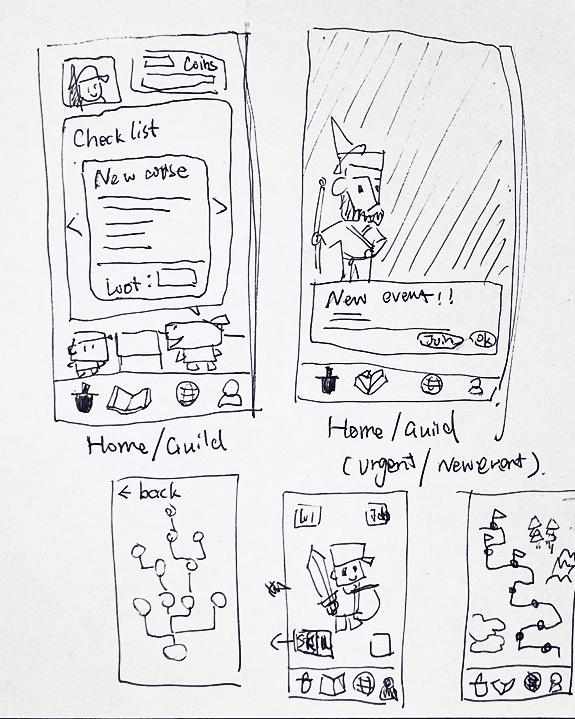




The visual style attracted attention. Some even said training finally looked "interesting."
However, after 2 weeks testing, people became familiar with the interface, the same behaviours gradually returned:
I realised that, If a system needs constant novelty just to keep people engaged, the problem probably isn't the visuals or sample UI change.
So I went back to interview and shadow with our front-line employees for more insights.
Insights as followed.


Behaviour Patterns
Outside the LMS, almost every digital product our staff (Gen Z & Millennials) interacted with shared a similar patterns:
- Short pieces of information.
- Continuous interaction.
- Immediate feedback.
- Small but frequent rewards.
Yet once they entered the training system, it suddenly became long, static and delayed.

One Target at a time
Instead of presenting every course at once, learners only make one decision at a time. Presenting one course at a time lowers the psychological barrier to getting started and turns a large task into a series of manageable decisions.
The current card also provide more information about this course, so users can easily have a picture in their mind what contents they are facing.
In the bata testing, the course entry time was reduced about
100
%
Smaller learning units
Instead of requiring learners to sustain attention across long articles, the redesigned course delivered information in smaller, sequential sections. It helped maintain reading continuity while reducing the urge to skip ahead.


Swipe-based navigation replaces traditional course lists with a familiar interaction pattern, encouraging learners to naturally continue to the next step.
During beta testing, participants completed courses in a duration much closer to the expected learning time, suggesting a noticeable reduction in skipping and passive browsing.
Every Answer Should Matter
Assessment should reinforce learning, not reward persistence through repeated guessing. By combining limited lives, countdown timers and immediate emotional feedback, the redesigned quiz creates a continuous cycle of think → answer → react → continue.
Every interaction produces an immediate response, helping learners build confidence, reflect on mistakes and stay emotionally engaged. Rather than ending the learning journey, each question becomes another step that sustains attention, motivation and forward momentum.


Making progress visible
Learning isn't driven by a single interaction.
It is sustained by seeing progress, celebrating milestones and building an emotional connection with the journey.
To reinforce that experience, we redesigned progression beyond individual courses.
" width="709.572779244857px"><path d="M 1.221 11.279 C 11.396 11.279 17.21 2.521 5.582 3.981 C 5.582 -3.321 -3.14 -0.4 1.221 11.279 Z" fill="transparent" height="11.278717735220447px" id="RYfeqxtDD" stroke-dasharray="0" stroke-linecap="round" stroke-linejoin="round" stroke-width="5" stroke="rgb(115, 148, 201)" transform="translate(416.725 73.708)" width="12.003566672054433px"/><path d="M 0 190.789 C 176.779 -59.996 272.918 -51.174 217.095 145.018 C 235.018 82.051 331.461 47.212 301.409 91.026 C 266.21 142.328 346.468 134.814 346.468 134.814 C 359.55 134.328 381.937 125.747 401.707 107.066 C 393.948 114.363 371.153 134.814 411.881 134.814 C 504.911 134.814 545.148 27.508 519.447 22.379 C 504.911 19.478 406.062 145.018 548.517 145.018 C 674.978 145.018 672.071 34.058 606.663 47.212 C 536.997 61.226 476.062 148.214 586.809 144.079 C 668.074 141.045 694.841 126.868 682.565 119.492 C 657.212 104.258 650.646 135.759 709.573 144.079" fill="transparent" height="190.78859130221286px" id="kzGa5HCHF" stroke-dasharray="0" stroke-linecap="round" stroke-linejoin="round" stroke-width="15" stroke="rgb(115, 148, 201)" transform="translate(0 0)" width="709.5727791688212px"/></g></svg>)